Theming
Theming allows you to customize the visual appearance of your site using design variables. This guide covers the theming system and how to customize your site's look and feel.
What are Design Variables?
Design variables are named CSS custom properties that control visual aspects of your site:
- Colors: Primary, secondary, background, text colors
- Typography: Font families, sizes, weights, line heights
- Spacing: Margins, padding, gaps
- Layout: Container widths, grid columns
- Borders: Border widths, radii, styles
- Shadows: Box shadows, text shadows
Platform Defaults vs Site Overrides
The CMS uses a two-tier theming system:
- Platform Defaults: Base values defined at the platform level
- Site Overrides: Custom values specific to your site
When you customize a variable for your site, it overrides the platform default. Variables you don't customize continue to use the platform default.
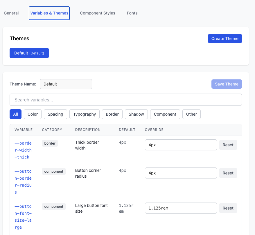
Accessing Theme Settings
To customize your site's theme:
- Navigate to Sites → Select your site
- Click Settings → Theme
- Browse variables by category
- Customize values as needed
- Click Save
Variable Categories
Colors
Control the color palette of your site:
Variable | Description | Default |
|---|---|---|
--color-primary | Primary brand color | #3b82f6 |
--color-secondary | Secondary brand color | #8b5cf6 |
--color-background | Page background color | #ffffff |
--color-text | Primary text color | #1f2937 |
--color-text-muted | Secondary text color | #6b7280 |
--color-border | Border color | #e5e7eb |
--color-success | Success state color | #10b981 |
--color-warning | Warning state color | #f59e0b |
--color-error | Error state color | #ef4444 |
Typography
Control text appearance:
Variable | Description | Default |
|---|---|---|
--font-family-base | Body text font | system-ui, sans-serif |
--font-family-heading | Heading font | system-ui, sans-serif |
--font-size-base | Base font size | 16px |
--font-size-sm | Small text | 14px |
--font-size-lg | Large text | 18px |
--font-size-xl | Extra large text | 20px |
--font-weight-normal | Normal weight | 400 |
--font-weight-medium | Medium weight | 500 |
--font-weight-bold | Bold weight | 700 |
--line-height-base | Base line height | 1.5 |
--line-height-heading | Heading line height | 1.2 |
Spacing
Control margins, padding, and gaps:
Variable | Description | Default |
|---|---|---|
--spacing-xs | Extra small spacing | 4px |
--spacing-sm | Small spacing | 8px |
--spacing-md | Medium spacing | 16px |
--spacing-lg | Large spacing | 24px |
--spacing-xl | Extra large spacing | 32px |
--spacing-2xl | 2x extra large spacing | 48px |
Layout
Control page layout and structure:
Variable | Description | Default |
|---|---|---|
--container-max-width | Maximum content width | 1280px |
--container-padding | Container padding | 16px |
--grid-gap | Grid gap | 16px |
--grid-columns | Grid columns | 12 |
Borders
Control border appearance:
Variable | Description | Default |
|---|---|---|
--border-width | Default border width | 1px |
--border-radius-sm | Small border radius | 4px |
--border-radius-md | Medium border radius | 8px |
--border-radius-lg | Large border radius | 12px |
--border-radius-full | Full border radius | 9999px |
Shadows
Control shadow effects:
Variable | Description | Default |
|---|---|---|
--shadow-sm | Small shadow | 0 1px 2px rgba(0,0,0,0.05) |
--shadow-md | Medium shadow | 0 4px 6px rgba(0,0,0,0.1) |
--shadow-lg | Large shadow | 0 10px 15px rgba(0,0,0,0.1) |
Customizing Variables
Using the Theme Editor
- Navigate to Theme settings
- Find the variable you want to customize
- Enter a new value
- Preview the change in real-time
- Click Save to apply
Value Formats
Different variable types accept different value formats:
- Colors: Hex (#3b82f6), RGB (rgb(59, 130, 246)), HSL (hsl(217, 91%, 60%))
- Sizes: Pixels (16px), rems (1rem), percentages (100%)
- Fonts: Font family names ("Helvetica Neue", sans-serif)
- Weights: Numeric (400, 700) or keywords (normal, bold)
- Shadows: CSS shadow syntax (0 4px 6px rgba(0,0,0,0.1))
Visual Indicators
In the theme editor:
- Default values: Shown in grey
- Overridden values: Shown in blue with a "Reset" button
- Invalid values: Shown in red with an error message
Resetting to Defaults
To reset a variable to its platform default:
- Navigate to Theme settings
- Find the overridden variable (shown in blue)
- Click Reset next to the variable
- Click Save
To reset all variables:
- Navigate to Theme settings
- Click Reset All to Defaults
- Confirm the action
- Click Save
Applying Theme Changes
After saving theme changes:
- Perform a site rebuild to apply changes to all published pages
- Navigate to Sites → Select your site → Settings → Advanced
- Click Rebuild Site
Note: Theme changes only affect published pages after a rebuild. Draft pages in the editor will show changes immediately.
Theme Best Practices
Color Selection
- Accessibility: Ensure sufficient contrast between text and background colors (WCAG AA: 4.5:1 for normal text)
- Consistency: Use a limited color palette (primary, secondary, accent)
- Brand alignment: Match your brand guidelines
- Test in context: Preview colors on actual content
Typography
- Readability: Use legible font sizes (minimum 16px for body text)
- Hierarchy: Create clear visual hierarchy with size and weight
- Line height: Use appropriate line height for readability (1.5 for body text)
- Font pairing: Limit to 2-3 font families maximum
Spacing
- Consistency: Use a consistent spacing scale
- Rhythm: Create visual rhythm with consistent spacing
- Whitespace: Don't be afraid of whitespace — it improves readability
- Responsive: Consider how spacing scales on different devices
Performance
- System fonts: Use system fonts for better performance
- Web fonts: If using web fonts, limit to 2-3 weights
- Shadows: Use shadows sparingly — they impact rendering performance
- Colors: Prefer solid colors over gradients for better performance
Advanced Theming
Exporting Theme
To export your theme as JSON:
- Navigate to Theme settings
- Click Export Theme
- Save the JSON file
This creates a JSON file with all your site overrides:
{
"--color-primary": "#3b82f6",
"--color-secondary": "#8b5cf6",
"--font-family-base": "Inter, sans-serif"
}
Importing Theme
To import a theme from JSON:
- Navigate to Theme settings
- Click Import Theme
- Select your JSON file
- Review the changes
- Click Apply
Copying Theme Between Sites
To copy a theme from one site to another:
- Export the theme from the source site
- Navigate to the destination site
- Import the exported theme JSON
Breakpoints and Responsive Design
Breakpoints control responsive behavior. See Breakpoints for details on customizing breakpoints.
Variable Reference
For a complete list of all available design variables with descriptions and defaults, visit:
Settings → Variables → Variable Reference
This page dynamically generates a reference from the platform's variable registry.
Troubleshooting
Changes Not Appearing
If theme changes don't appear on published pages:
- Rebuild the site: Theme changes require a rebuild
- Clear browser cache: Hard refresh (Ctrl+Shift+R or Cmd+Shift+R)
- Wait for CDN: CDN cache may take a few minutes to clear
- Check overrides: Verify your overrides are saved
Invalid Value Error
If you see an "Invalid value" error:
- Check format: Ensure the value matches the expected format
- Check units: Include units for size values (px, rem, %)
- Check syntax: Verify CSS syntax for complex values (shadows, fonts)
- Reset and retry: Reset to default and try again
Colors Look Wrong
If colors don't match expectations:
- Check color format: Ensure hex, RGB, or HSL is correct
- Check contrast: Verify sufficient contrast for accessibility
- Check inheritance: Some components may override theme colors
- Test in different browsers: Color rendering may vary slightly
Related Topics
- Design Variables — Technical details on design variables
- Publishing — Rebuild sites to apply theme changes
- Component Structure — How components use design variables